GOAL
The goal for this project was to create branding for an event that was to be put on by Creative Mornings, an organization that hosts creative workers for talks about specific one word themes like harmony or balance, or about projects they have worked on. I chose structure as the theme for this event and created promotional posters, banner stands for the location of the event, a stage backing, a shirt, and a photo opp after I had solidified some brand guidelines. My aim was to use stripped down brand guidelines with simple shapes to build visual structures that are not built within an external grid but support themselves and justify their own structures, instilling a sense of order.
This project was made into an annual design workshop in order to justify the larger scale branding that isn’t normally present in the creative morning talks, as well as the international speaker that is advertised to be at the event.
DEVELOPMENT
The approach I took to develop the visuals for the event was to create look and feel posters in order to find visual elements and typography that worked towards my goal. The purpose of these posters was not to relay information but to develop the look of the branding as part of the development phase. They were useful for experimenting with structure and then integrating text within that structure, and certain assets were used for the rest of the project.
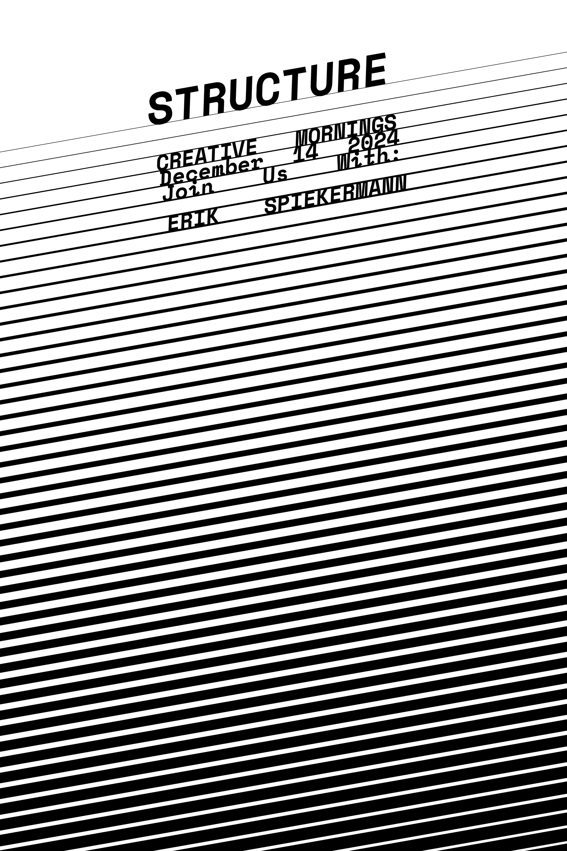
LOOK AND FEEL POSTER 1
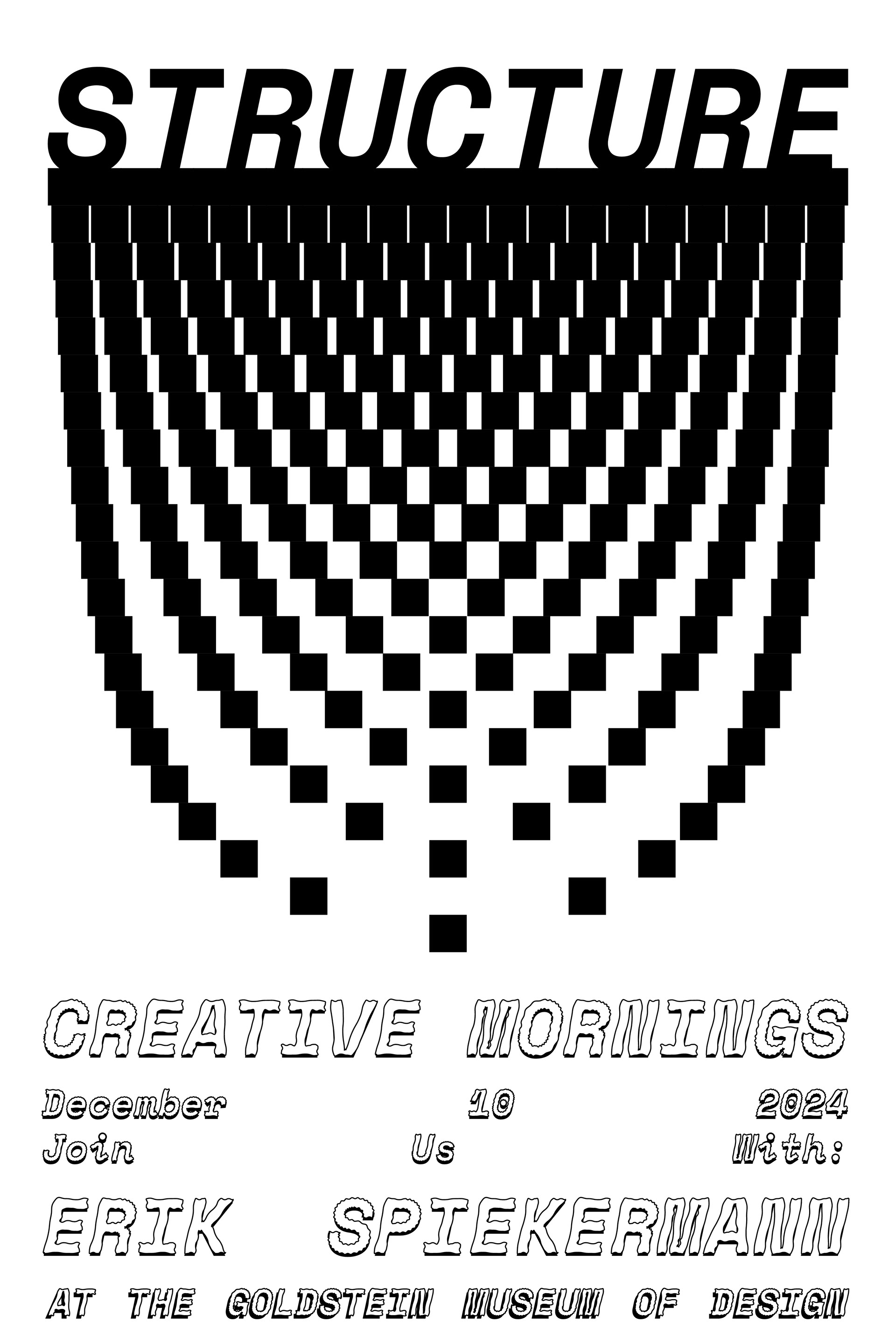
LOOK AND FEEL POSTER 2
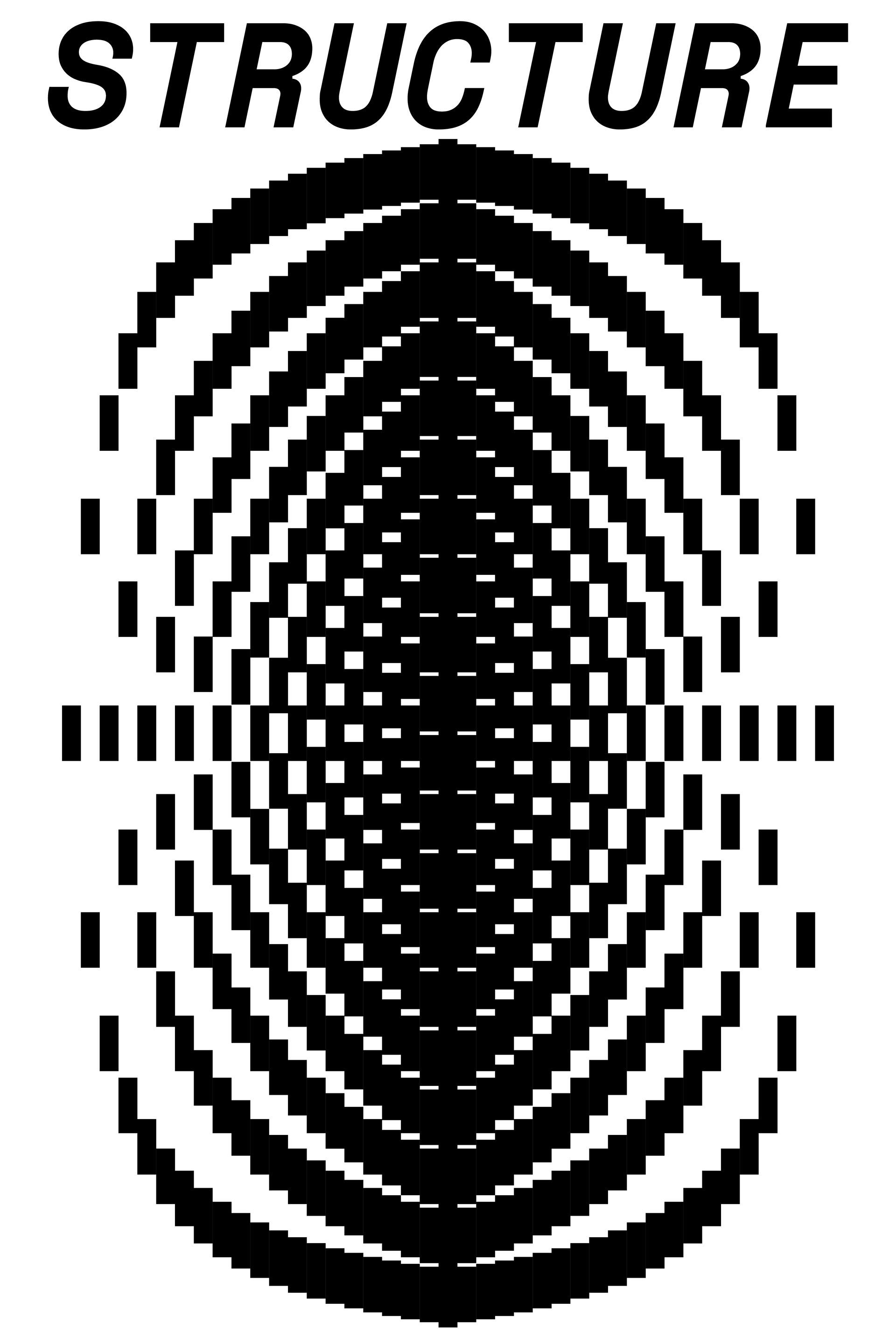
LOOK AND FEEL POSTER 3
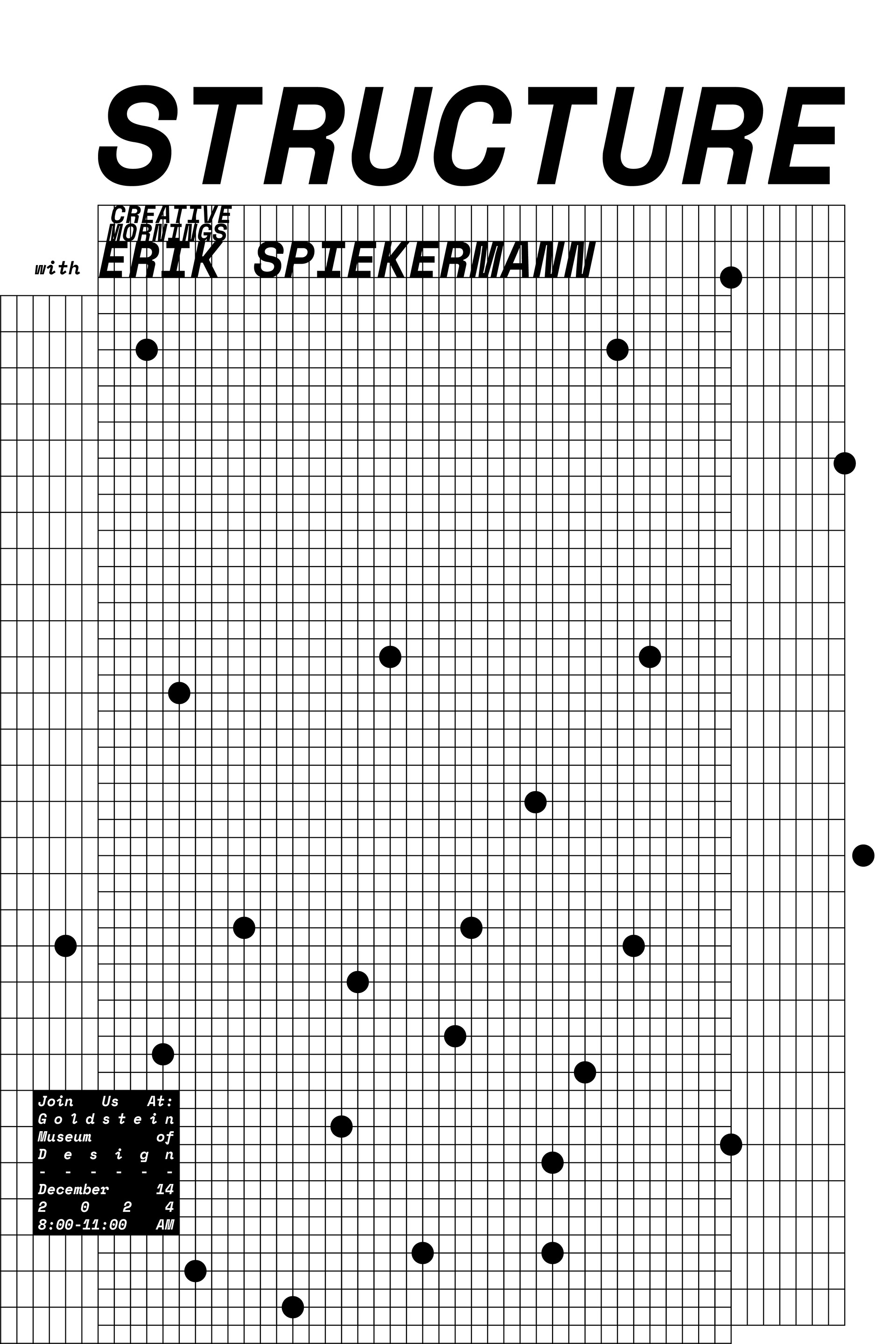
LOOK AND FEEL POSTER 4
BRANDING
The guidelines show the use of black and white as the colors for the branding. This is done so that the structure is first and foremost what a viewer notices about each part of the project. The high contrast elevates the sharp straight lines of the simple geometric shapes and elevates negative space as a feature of each structure. Next I chose a mono-type, arguably the most structured style of type, that was bolded and italicized for the deliverables with the slant contrasting nicely with the verticality of the squares and rectangles used. The simple graphic assets are shown and a few examples of how they are to be used are shown underneath. The logo works as a mark because of the solid shape, but it was usually deconstructed as the text was used playfully to integrate with the structure that it would find itself in.
FINAL PROMOTIONAL POSTERS
These are promotional posters used to showcase the theme of the talk as well as communicate information about the event.
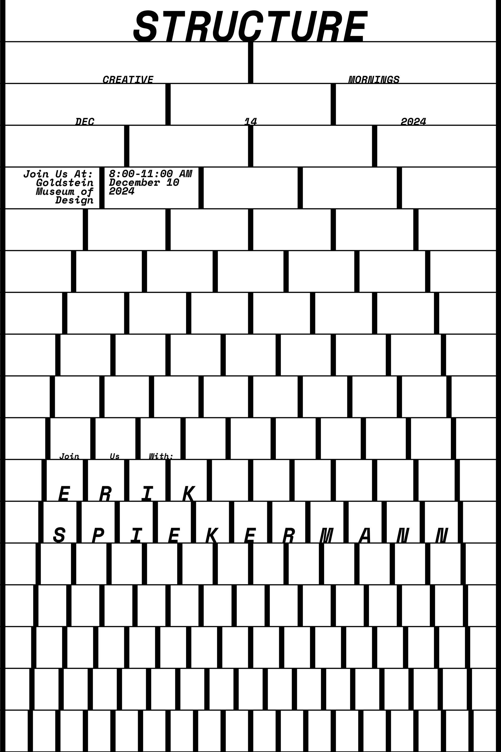
PROMOTIONAL POSTER 1
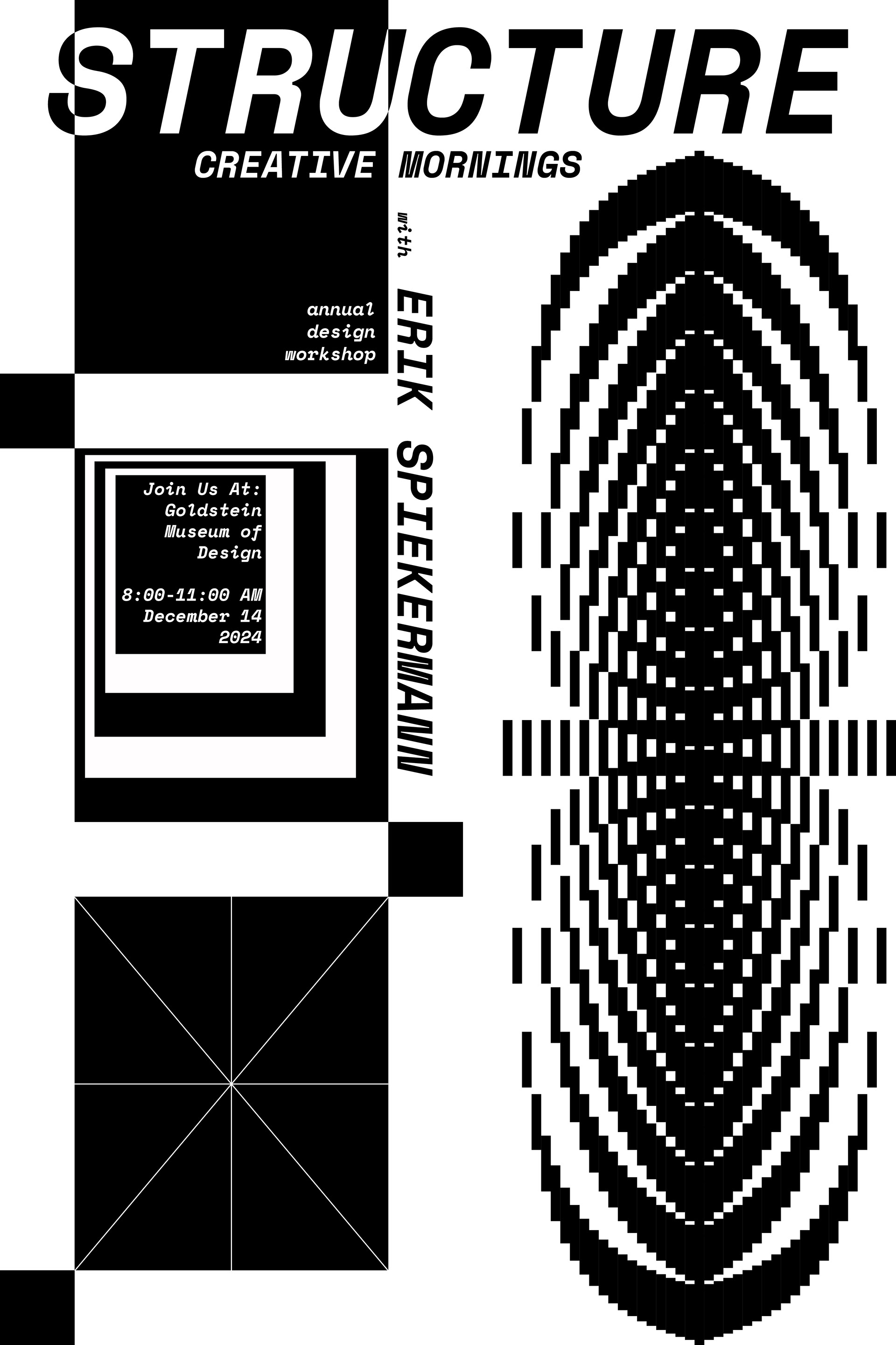
PROMOTIONAL POSTER 2
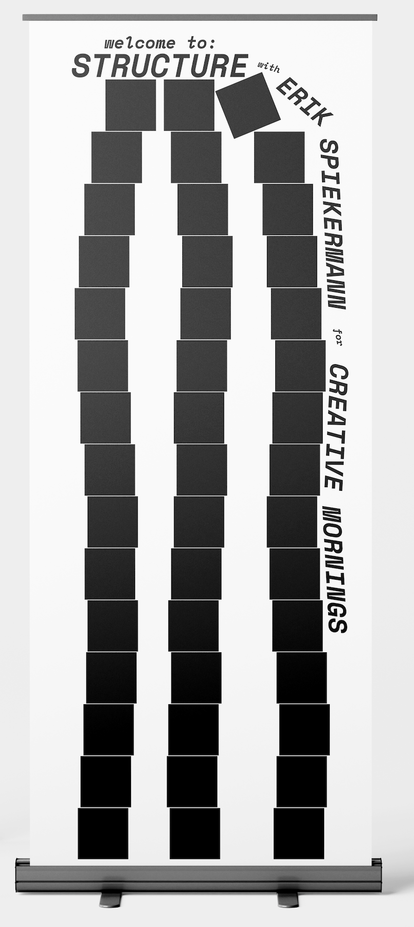
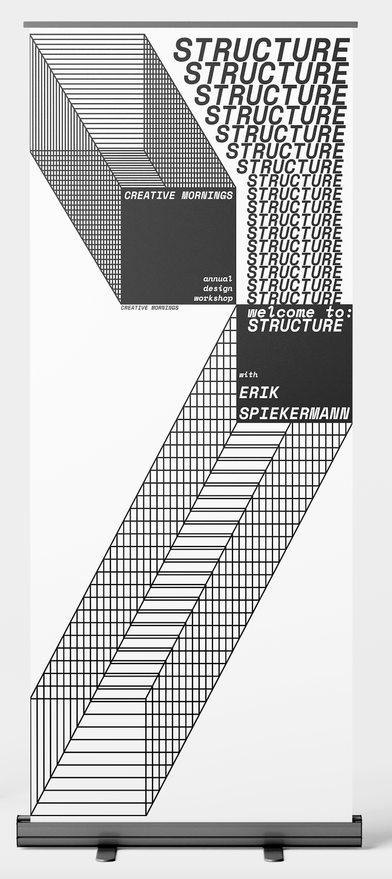
BANNER STANDS
The banner stands welcome the participants of the event and use very simple elements that repeat to create the feeling of structure on a larger scale than the posters, while at the same time acting as an extension of them.
STAGE BACKING
This stage backing is made of wooden shelving and wooden blocks, all in black to allow it to fall into the background. This structure and material would be relatively cheap and provide viewers with a tactile representation of the theme of the event.
PHOTO OPP
The photo opp was designed to be visually appealing to serve the participants of the event. I would personally be much more likely to take a picture in front of a cool backing with little or no branding than if there was branding material on it. If people show this picture to friends they are likely to talk about the event whether there is branding or not.
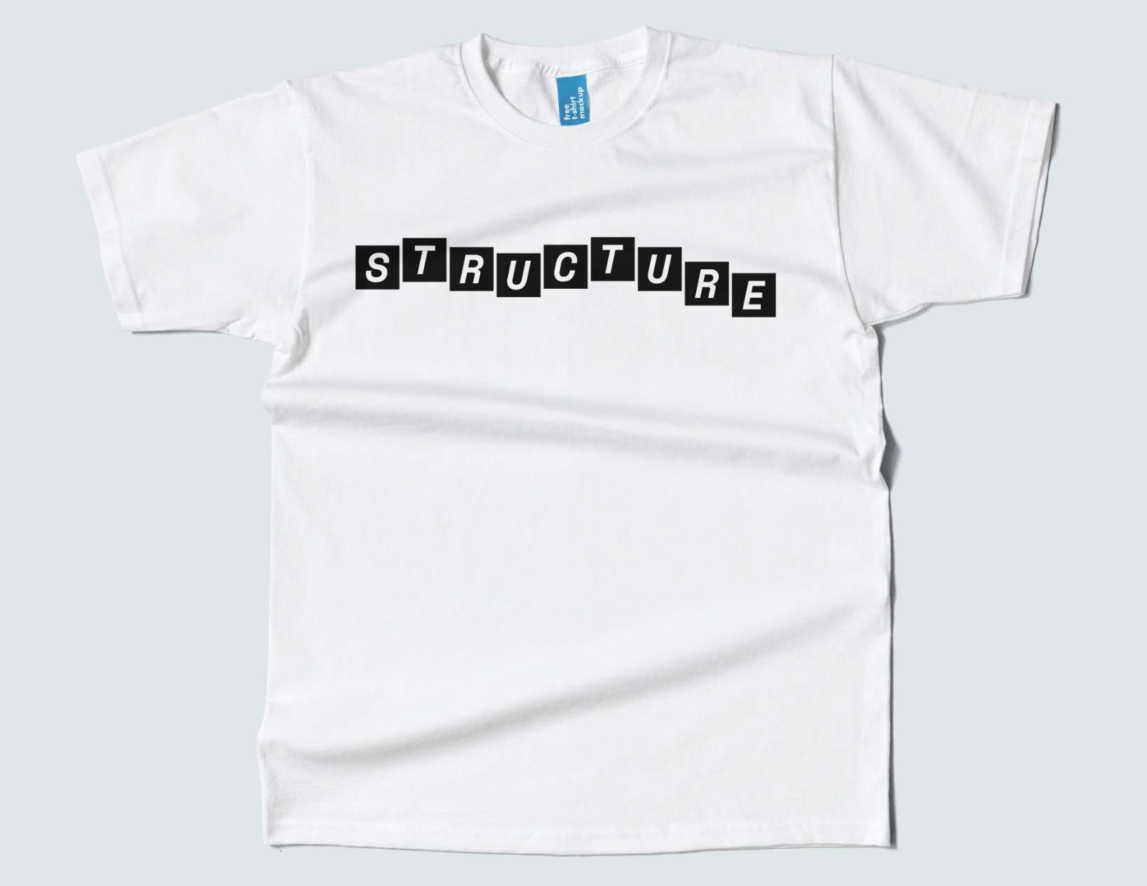
MERCH
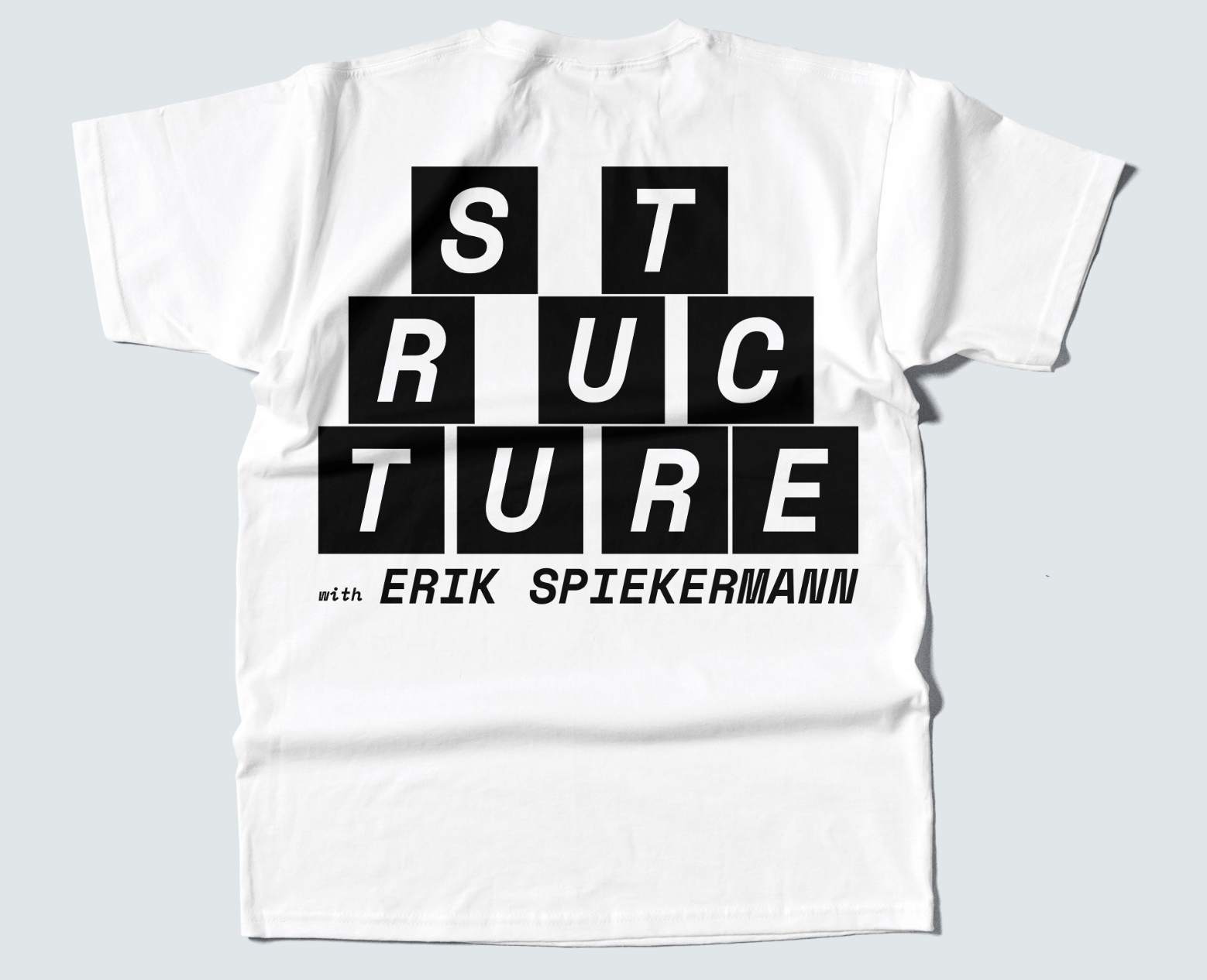
The merch is meant to be fun while showing off playful type. The simplicity and scale make for an interesting dynamic that will likely make others inquire about it while worn.
SHIRT FRONT
