GOAL
The goal for this project was to remake an album cover and along the way create a gig poster and some merchandise.
The album cover I redesigned was Devotion by Beach House and can be seen below. I think this cover does actually represent the music well but it is a little low quality, albeit intentionally, and does not look very intriguing to those who aren’t familiar with their music before hand. I wanted to address this issue.
ORIGINAL ALBUM COVER
IDEATION
To brainstorm I drew and wrote the title out by hand. I played with illustrations while I scanned them in. I then searched for images in magazines for textures or images that could be used to enhance the minimalist instrumentals but rich meaning of the albums.
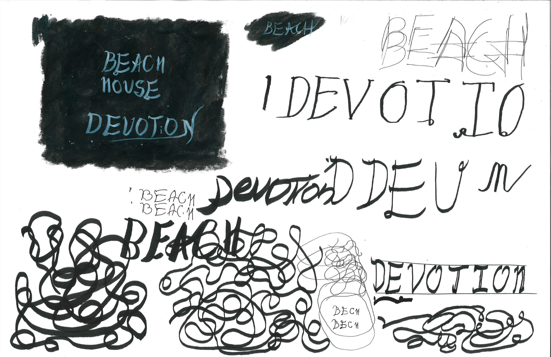
SEVERAL SCRIBBLES
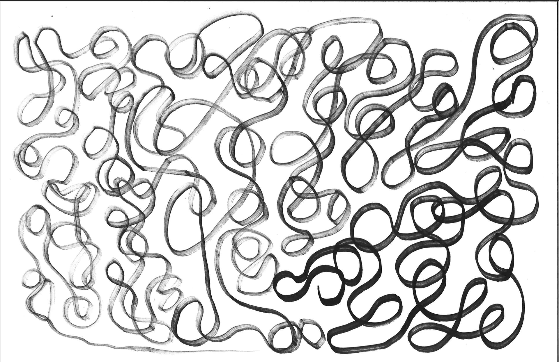
SINGLE SCRIBBLE
TYPE EXPERIMENTATION
A wide variety of typefaces and layouts were tested with the aim to fill the space in an interesting way.
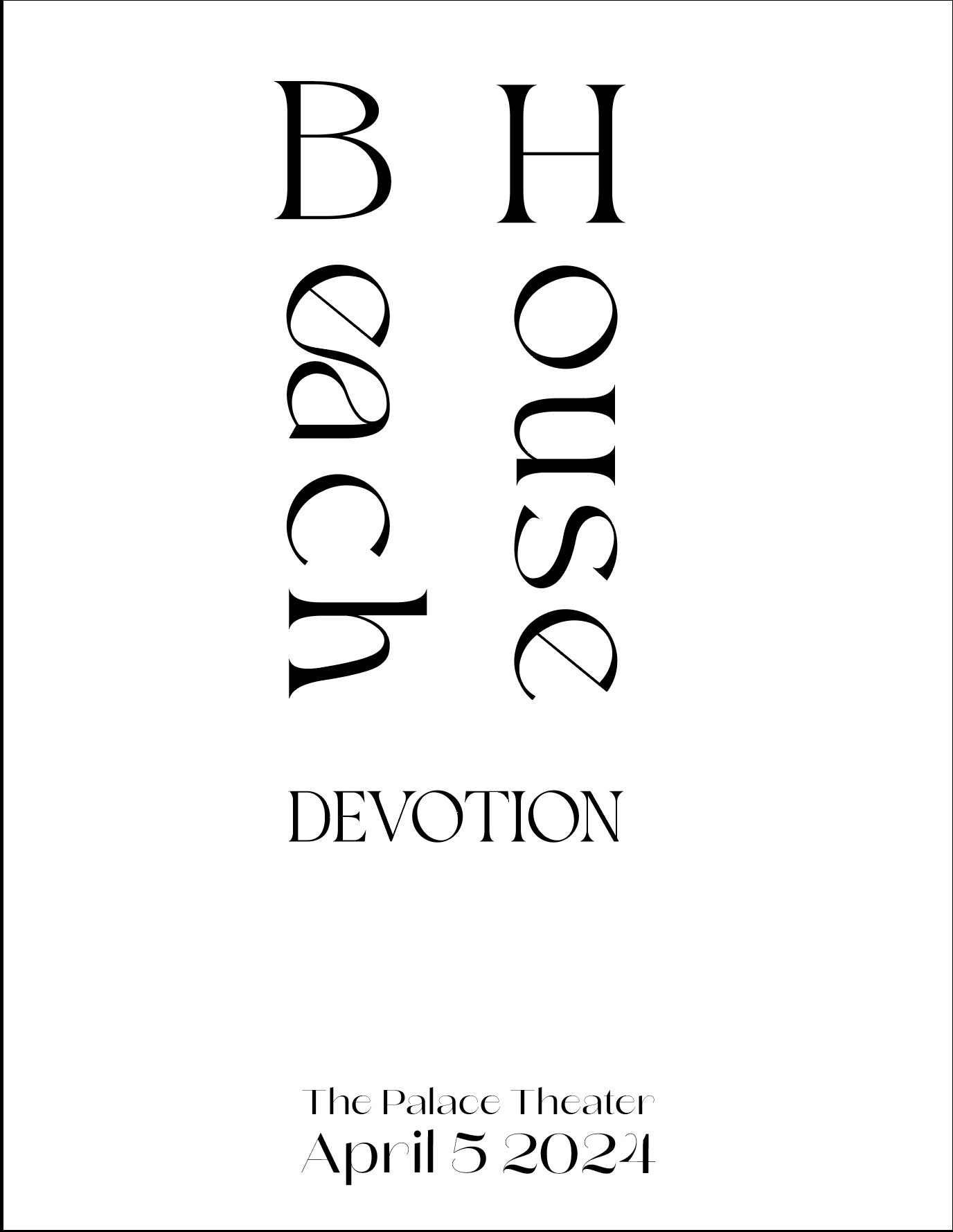
TYPE EXPERIMENT 1
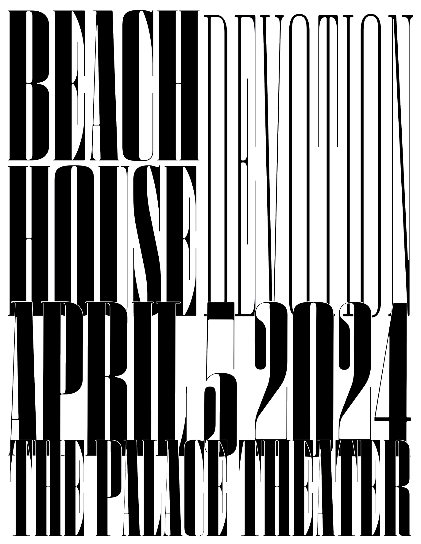
TYPE EXPERIMENT 2
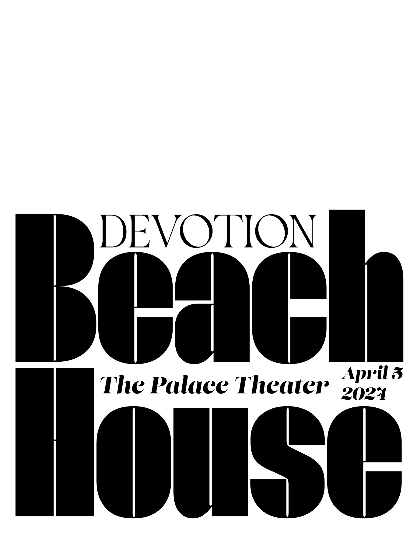
TYPE EXPERIMENT 3
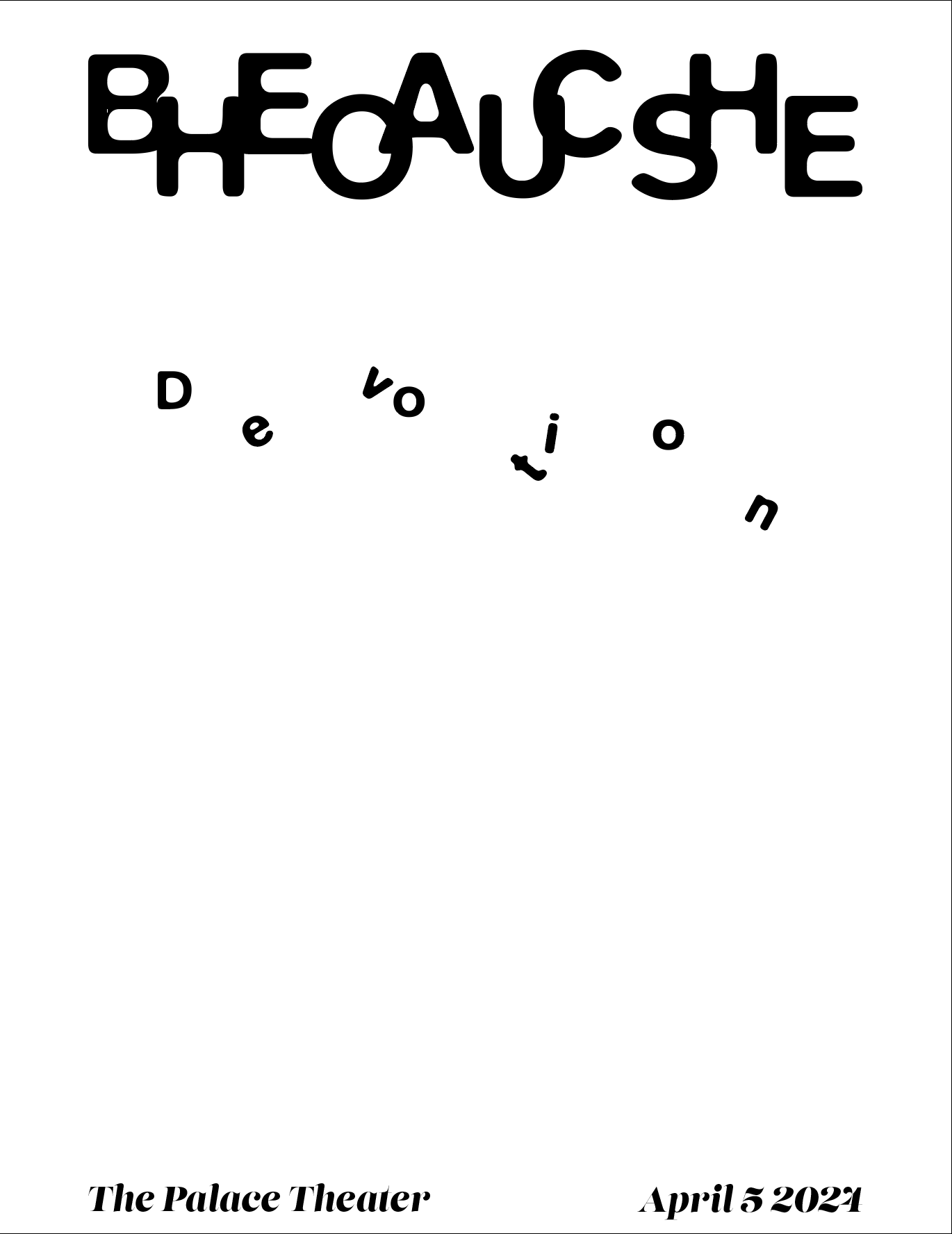
TYPE EXPERIMENT 4
IMAGE EXPERIMENTATION
Edited images were used with text to bring in some texture and depth.
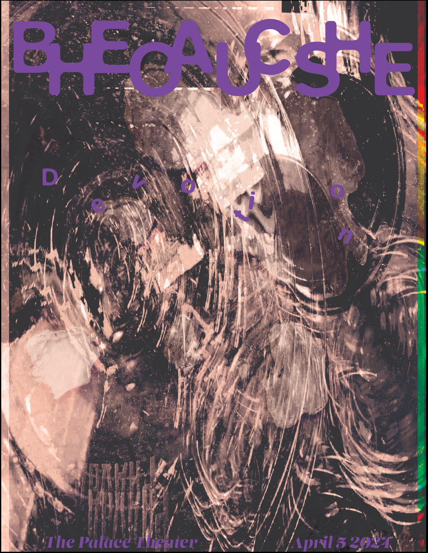
TEXTURAL EXPERIMENT 1
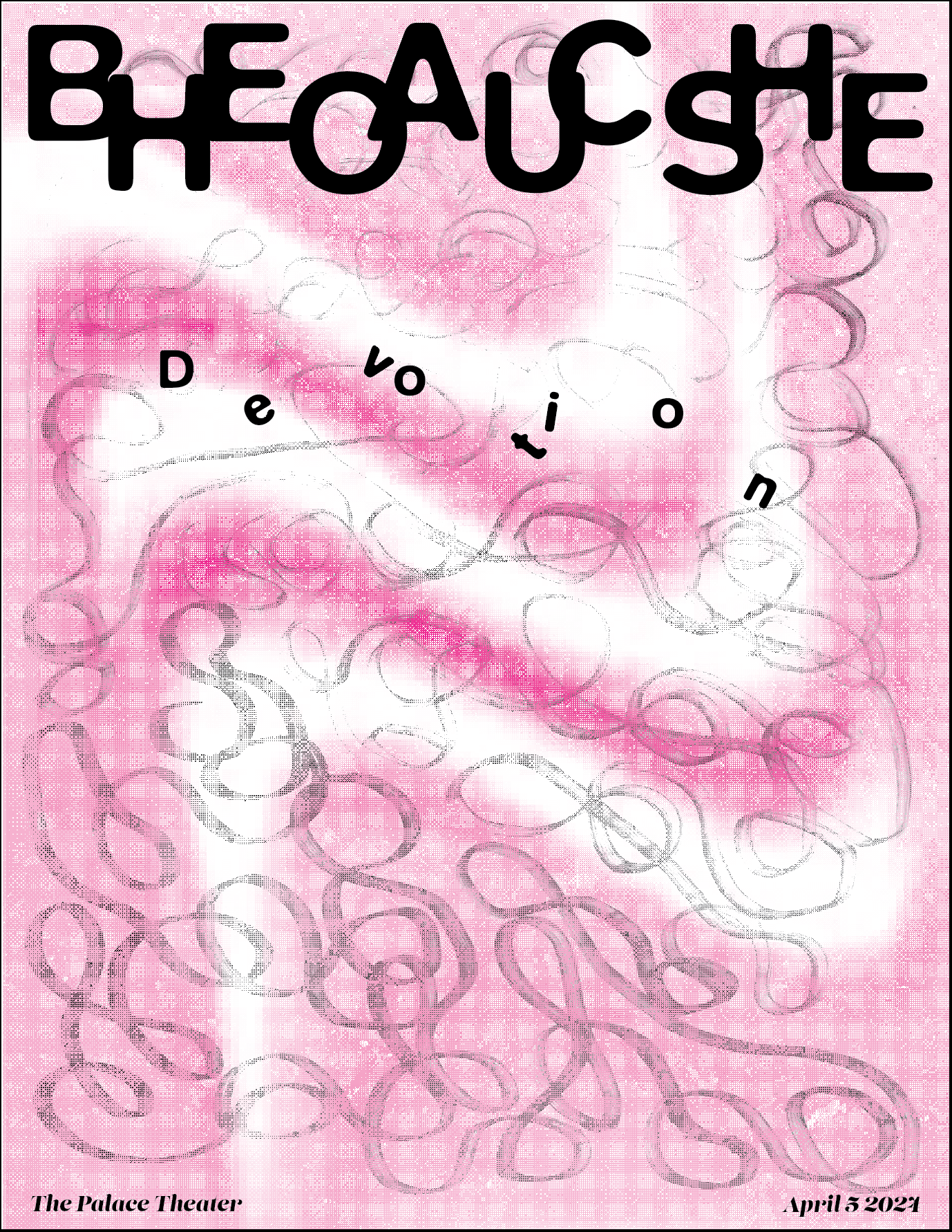
TEXTURAL EXPERIMENT 2
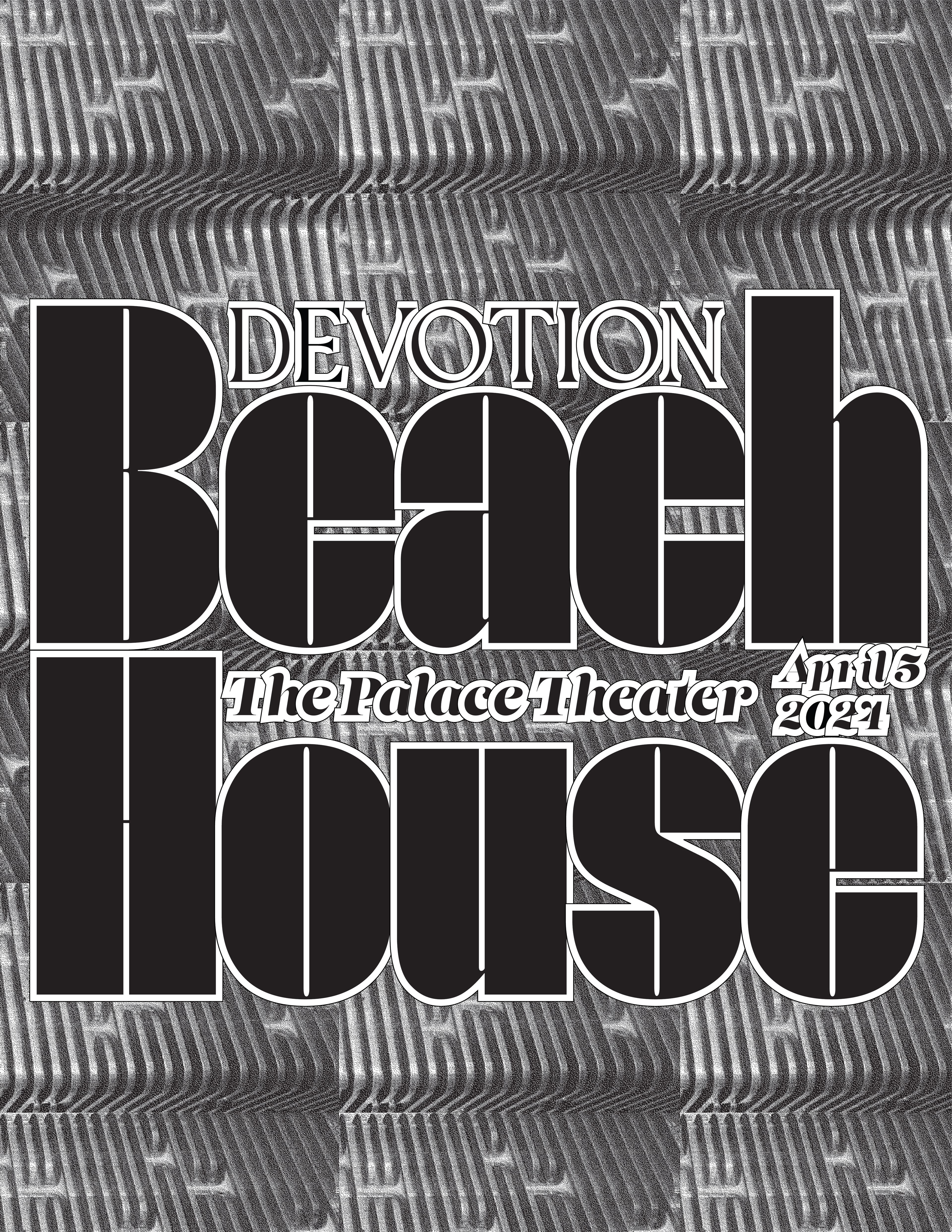
TEXTURAL EXPERIMENT 3
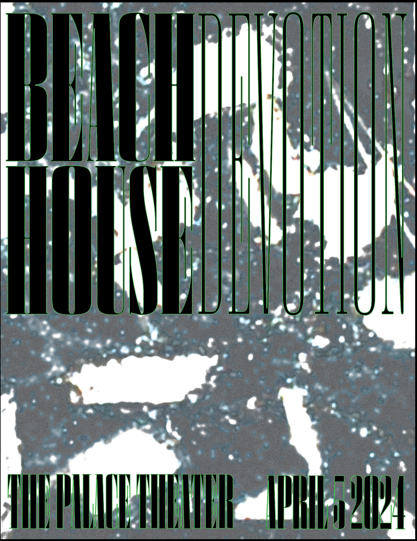
TEXTURAL EXPERIMENT 4
POSTER DRAFTS
The spectrum of colors on the first draft along with the texture and typeface in the third were combined to create the feel of the project; busy but interesting.
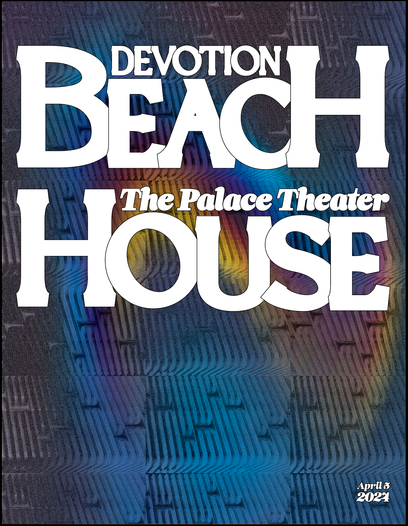
POSTER DRAFT 1
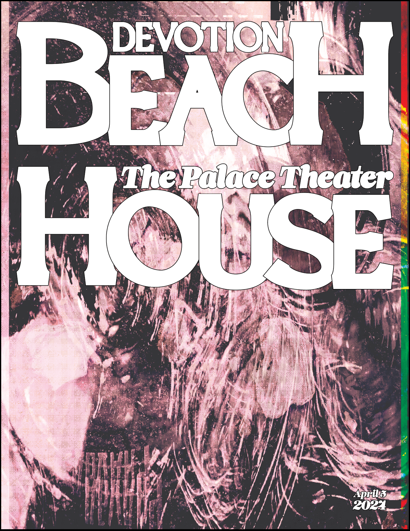
POSTER DRAFT 2

POSTER DRAFT 3
FINAL PROMOTIONAL POSTER
The final poster has subtle shifting colors, super condensed text that is a puzzle to read, and a busy texture in the background, both obscuring the letters and allowing them to pop.
ALBUM COVER TYPE EXPERIMENTATION
I laid out some alternative styles of text to see if I could find anything that would look different than the poster and still speak on the feel of the album while working together with the poster.

TYPE EXPERIMENTATION 1
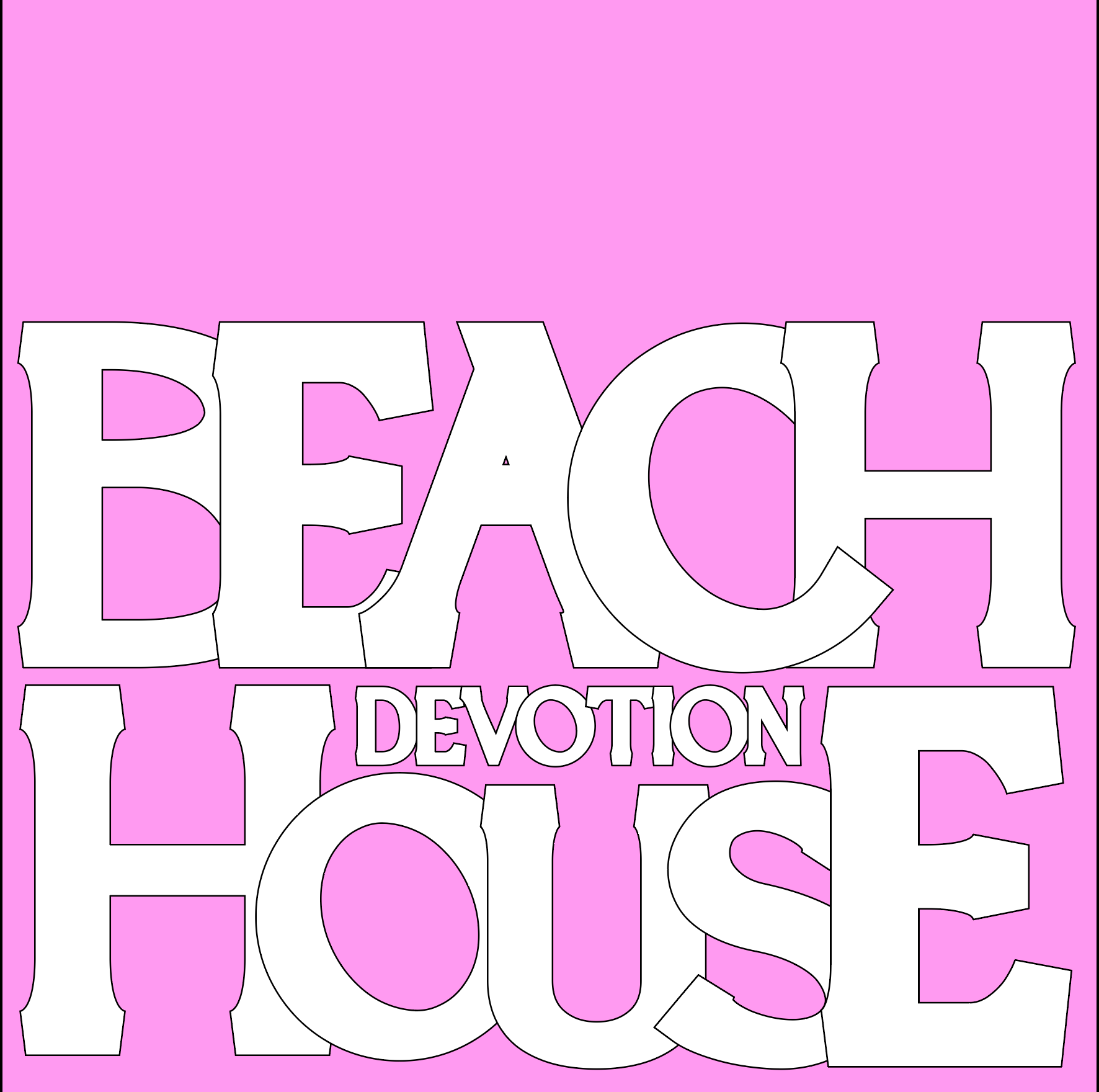
TYPE EXPERIMENTATION 2
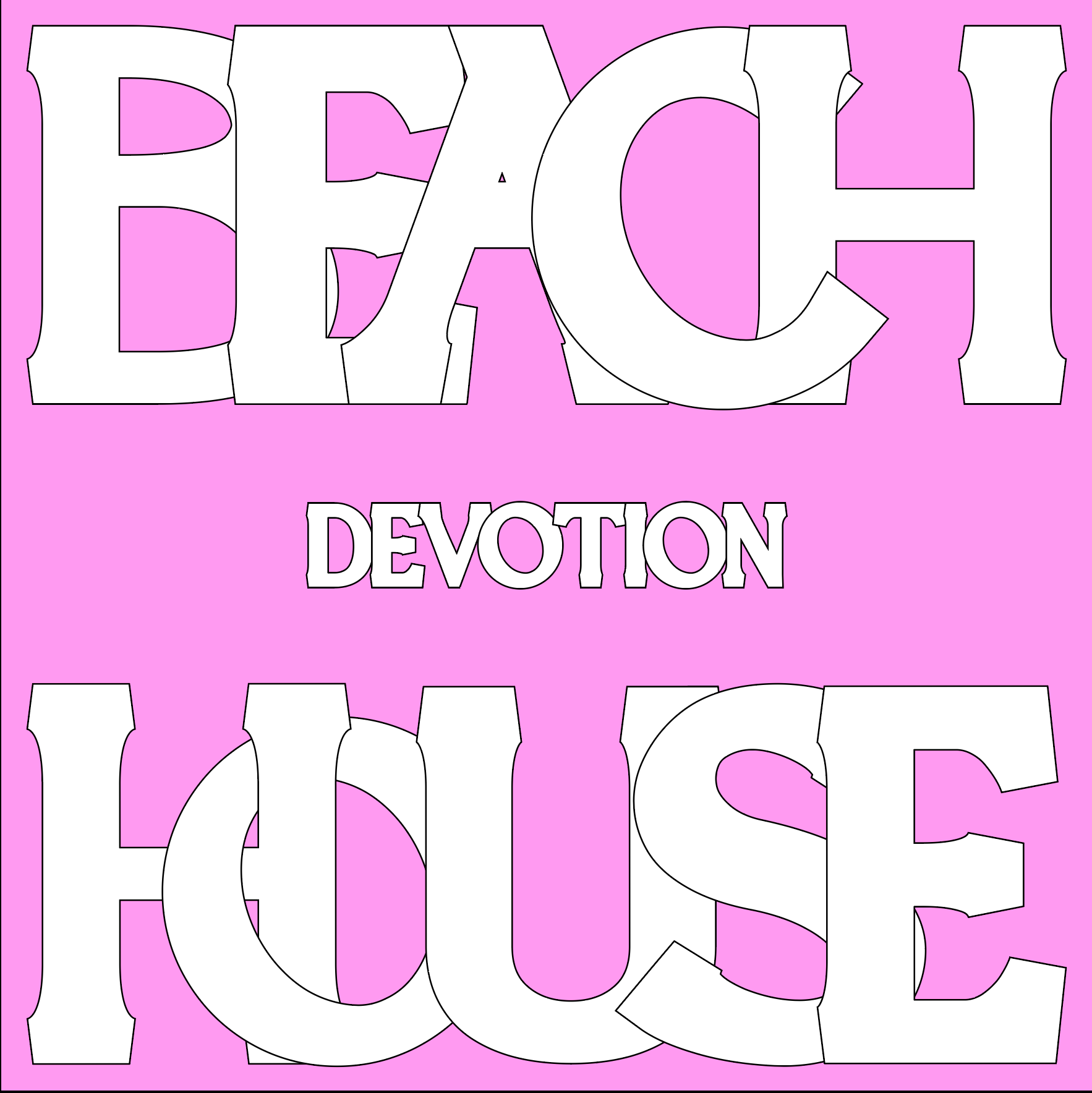
TYPE EXPERIMENTATION 3
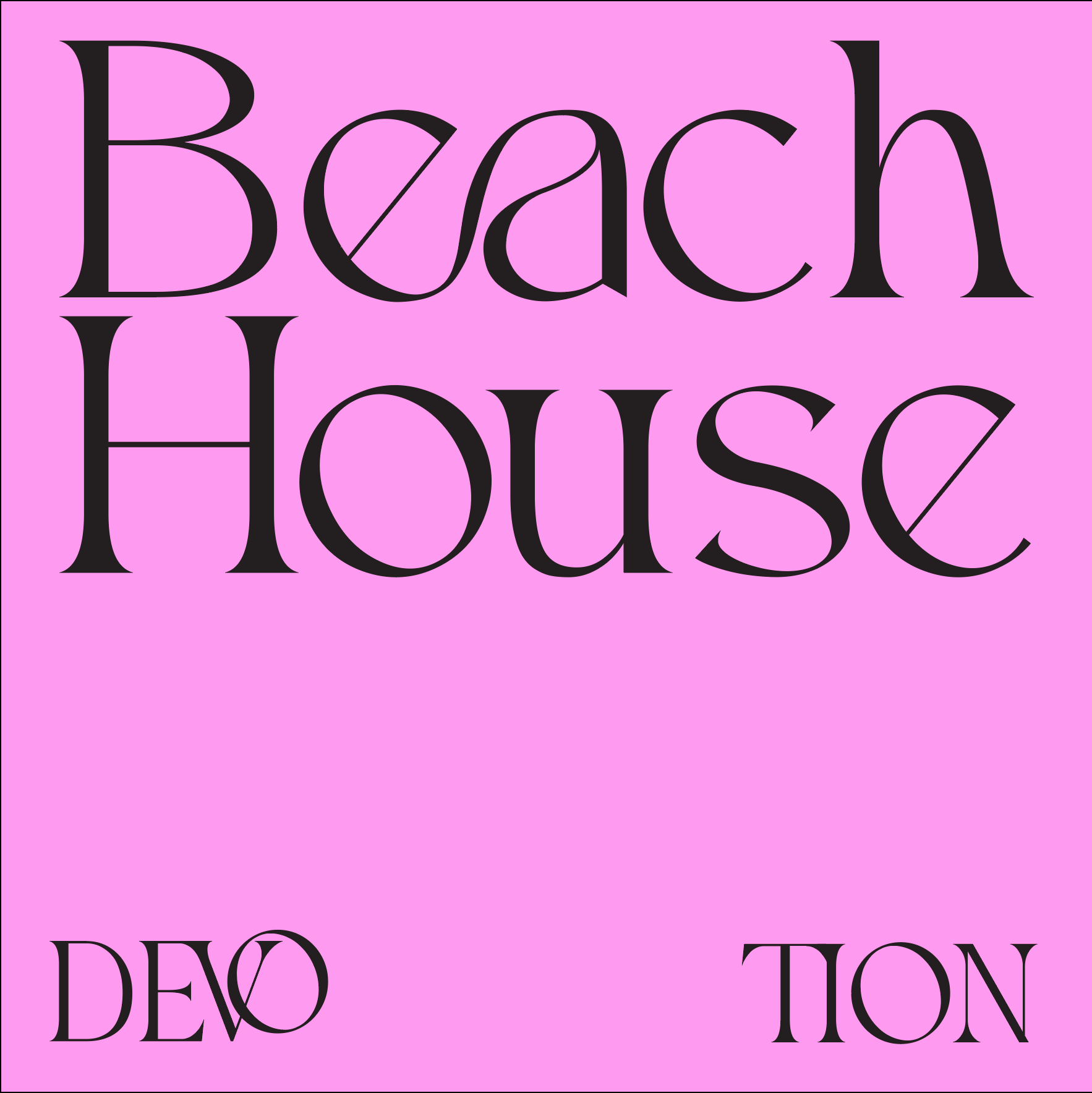
TYPE EXPERIMENTATION 4
ALBUM COVER DRAFTS
I decided on the same style of typography as I used on the poster and tried a few different backgrounds, these two were my favorites.
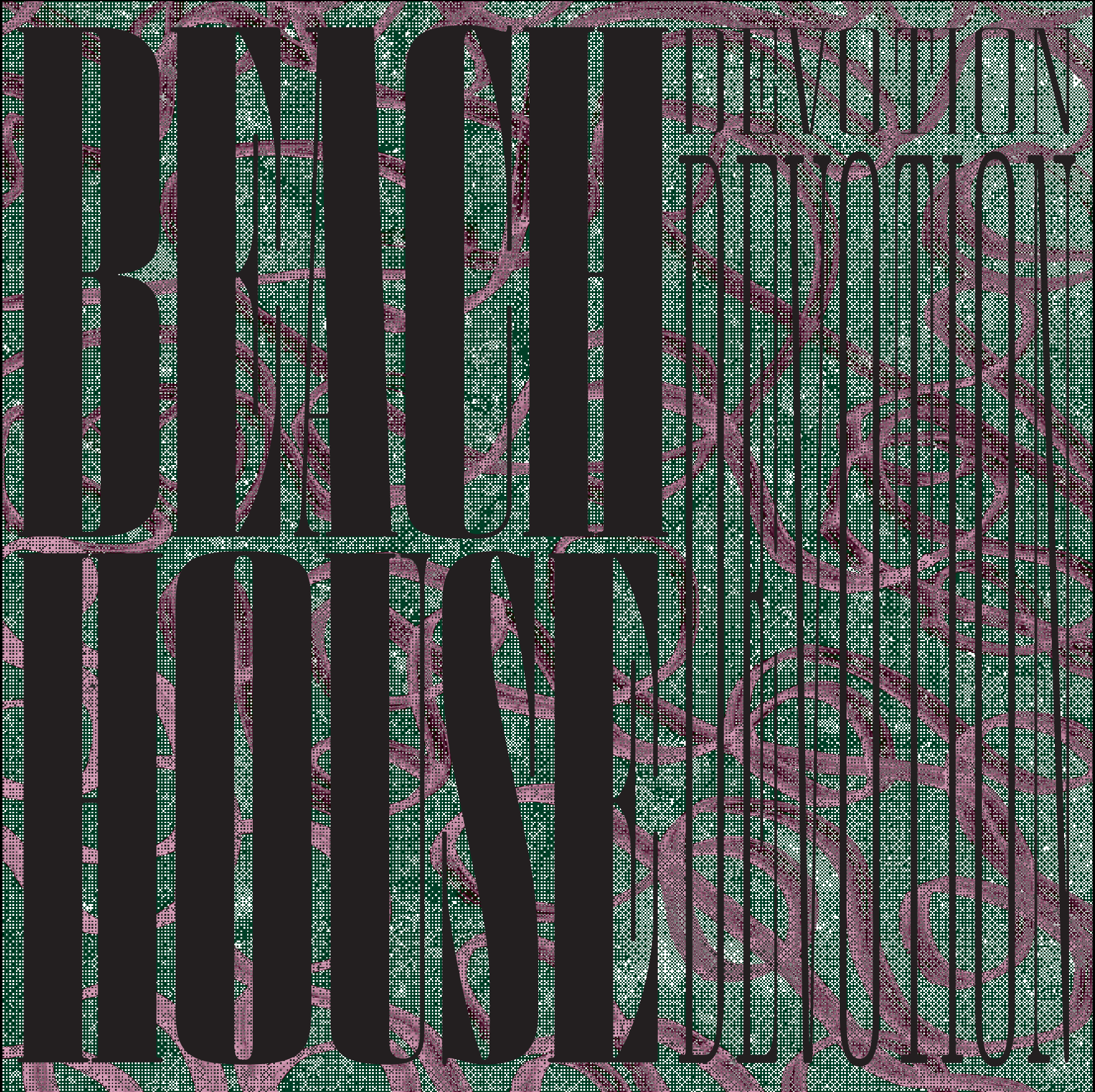
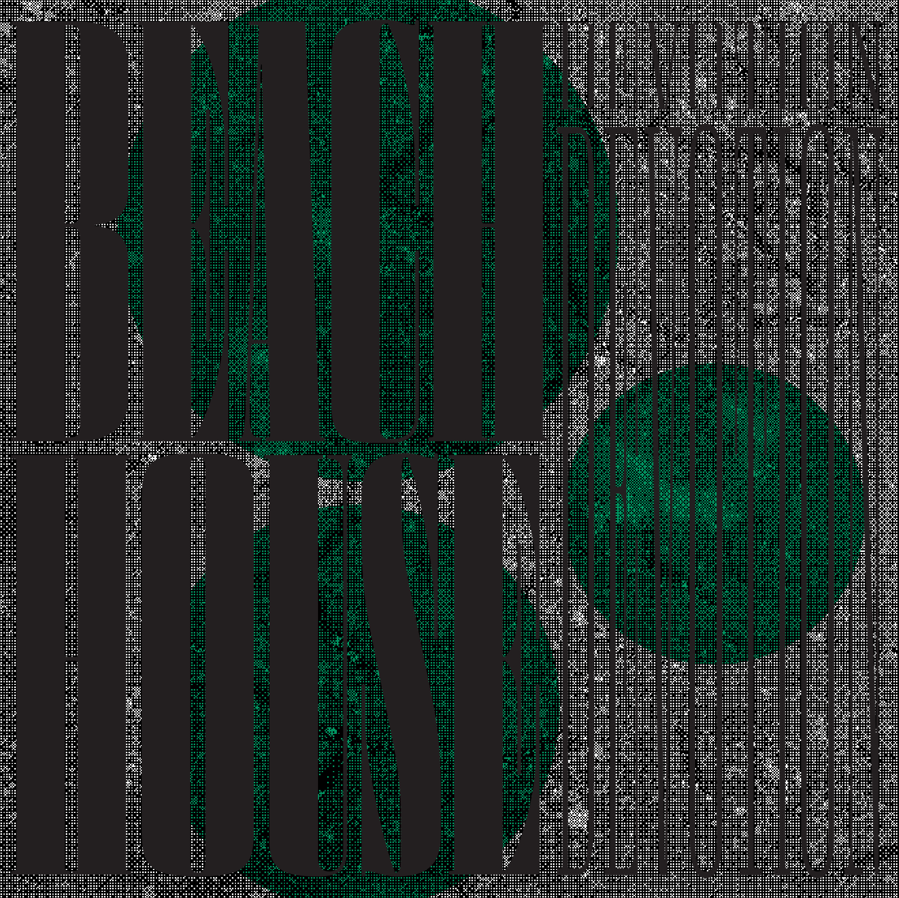
FINAL ALBUM COVER
The final album cover successfully uses texture, color, and typography to achieve the goal of creating a cover that is reflective of the mood of the album.
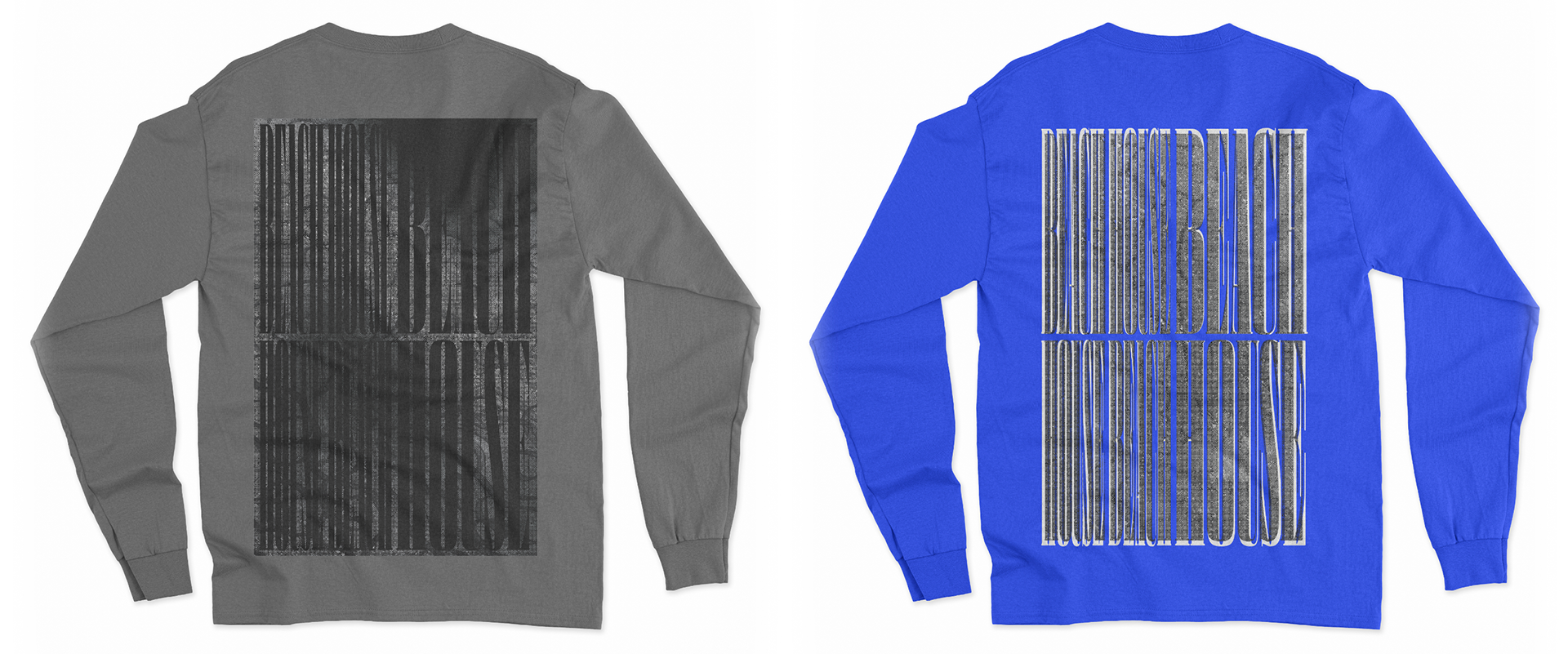
FINAL MERCH
Merch was made on shirts with intense text and texture mixed together and a unique dynamic is made between legibility and the shapes created by the letters.
